Blueprint CSS framework :Incorporating

What does Blueprint do?


Incorporating Blueprint CSS into your workflow

What does Blueprint do?
Blueprint's core feature set is as follows:

1. It performs a mass reset of browser default styles.
2. It sets up sensible defaults for typography, including font families, header sizes, paragraph styles, list styles, a baseline grid, and more. It does all of this with relative sizes, so that it scales well in any browser.
3. It gives you a methodology to use for customizable layout grids. Any number of columns and widths you can dream up is easily achievable.
4. It provides a sensible default print stylesheet.
5. It does all of these things in ways that work elegantly in most browsers your visitors are likely to be using, including Internet Explorer 6 and 7.

It's important to understand that all elements are override-able. Blueprint doesn't set out to be a stand-alone stylesheet for your site. Rather, it's a set of base styles you, the designer, can build on top of, override, or nix completely (by adding your own stylesheet(s) in addition to the ones Blueprint provides).

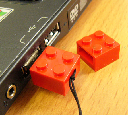
Think of it like this: building a design with CSS is like having a bucket full of melted plastic to work with. Building with Blueprint as your base is like having a set of Legos—but you still also have that melted plastic if you need it.

The grid
Blueprint's crown jewel is its grid-building tools. By default, Blueprint's grids.css file sets up a 950px wide grid of 24 columns, each 30 pixels wide with 10 pixel gutters. This grid is likely to be flexible enough for most of your needs.

However, the grid is fully customizable. If you need more or less columns or a wider or narrower total width, you'll want to use the Blueprint Grid CSS Generator tool. It not only provides a replacement grids.css file, but it also creates a grid.png image file for use as a background image during development—very handy for making sure everything lines up properly. The grid generator is a key piece to the framework, even if it's technically a third-party tool. Without it, Blueprint is limiting and controlling, forcing designers to use a single layout grid. With it, designers have endless freedom.

Incorporating BlueprintCSS into your workflow
If you intend to use Blueprint to build a design, it's best to decide this before you start working in Photoshop (or your design tool of choice). You can retrofit a design with Blueprint HTML and CSS, but it's much simpler to plan it from the beginning.

The designer will want to hit the afore-mentioned grid generator tool to come up with the exact number of columns, gutter size, and total width they're going to use. They should save the exported grid.css. Then, they can set up a Photoshop document with guides replicating this column structure.

At Blue Flavor, the designer may or may not be the same person that ends up building the HTML and CSS templates. When the designer hands off their finished comps to theHTML/CSS template author, he/she should make sure to also include the associated grid.css and let the template author know about the guides in the comp.

Tips, tricks, and best practices
When using Blueprint, it's really important to read all of the included CSS and fully understand what everything does and how it works before you dive in too deeply. If you don't, you're likely to miss really important elements, such as the .border, .colborder, .box, and .hide classes.

Also, don't be fooled by the grid documentation's suggestion to use div elements for all column units. You can apply the .column class to any element. For example, if you're using the default grid and you want a bar across the top of the page that includes your logo on the left and your navigation on the right, you can add class="column span-12" to an h1 and a ul, rather than making unnecessary divs.

Use multiple .container divs to create "rows" in your layout. Your header may be one container, your content may be another, and your footer may be yet another. Or, you may have many more. Don't think can only have one container.

Remember that you don't need to use all of the pieces of Blueprint CSS. For example, if you're not doing a grid-based layout, you may not need grid.css. But, reset.css and typography.css may still be useful to you.

And finally: don't ever edit Blueprint's files! A much better practice is to include your own stylesheet and override Blueprint. Editing Blueprint's CSS files will make upgrading to the latest version of the framework much more difficult. Keep your work separate from the framework.

http://blueflavor.com/blog/2007/oct/24/blueprint-css-101/


http://www.blueprintcss.org/tests/parts/sample.html
Read more!
Prototyping Website Structure A Must Watch VIDEO !

Starting a Prototype

Every web development project starts with different initial input. Sometimes an existing website is to be redesigned. Sometimes there's a detailed Request For Proposal, and sometimes there's a sitemap. Sitemaps are my enemy. They're such illusionists. They're so limited in how they define categories and relationships between pages. They fall far short of communicating the details of the pages themselves. Building a website based on a sitemap is insanity.


Grayscreen Prototyping video by Newfangled Web Factory.


Read more!
jQuery for Absolute Beginners: Video Series
http://nettuts.com/articles/web-roundups/jquery-for-absolute-beginners-video-series/#

great series. The tutorials are well made and easy to understand.

I loved this series of videos. It was great fun and I learnt some things I didn’t know before. Thanks guys!


jQuery for Absolute Beginners: Video Series

I loved this series of videos. It was great fun and I learnt some things I didn’t know before. Thanks guys!

RSS:
http://feedproxy.google.com/nettuts
Read more!
http://gotoandlearn.com


Lot of Flash action script Tips and Tuts


Lot of Flash action script Tips and Tuts
Read more!
BlueTrip CSS Framework

A full featured and beautiful CSS (Cascading Style Sheets) framework which combined the best of Blueprint, Tripoli (hence the name), Hartija's print stylesheet, 960.gs's simplicity, and Elements' icons, and has now found a life of its own.
What Can BlueTrip Do For You?

BlueTrip gives you a sensible set of styles and a common way to build a website so that you can skip past the grunt work and get right to designing.

Download the package, include the images and stylesheets in your site structure, and get going!

http://bluetrip.org/

BlueTrip CSS Framework

A full featured and beautiful CSS (Cascading Style Sheets) framework which combined the best of Blueprint, Tripoli (hence the name), Hartija's print stylesheet, 960.gs's simplicity, and Elements' icons, and has now found a life of its own.
What Can BlueTrip Do For You?

BlueTrip gives you a sensible set of styles and a common way to build a website so that you can skip past the grunt work and get right to designing.

Download the package, include the images and stylesheets in your site structure, and get going!


Read more!
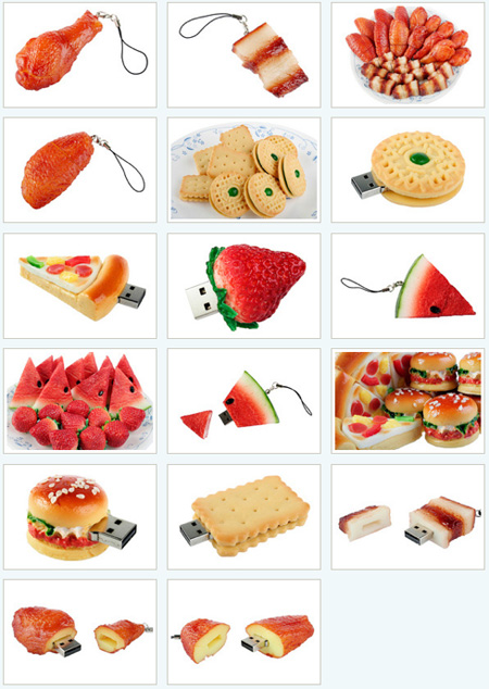
Realistic Food Shaped USB Flash Drives


Realistic Food Shaped USB Flash Drives


Realistic Food Shaped USB Flash Drives


Read more!
learn how to install the new sIFR 3 to your website!


learn how to install the new sIFR 3 to your website!

Basic Information about sIFR

sIFR is the “Healthy alternative to browser text”, regarding to the authors Mike Davidson and Mark Wubben. With sIFR it is possible to display fonts on the internet that doesn’t have to be installed on the computer of the user. sIFR creates more typography options for the web!

The technique is a combination between Flash, JavaScript, CSS and HTML. Due this fact you have to remember to use sIFR only on important titles and subtitles because otherwise it might drastically slow down your site.

How does sIFR work?

sIFR has a system that really works great. The browser of your visitor (sIFR is supported by almost all browsers that support Javascript and Flash!) loads a basic web page. Javascript checks if Flash is supported and if this is the case, Javascript adds tags around the elements that will use sIFR.

Flash will now automatically load Flash movies where the new tags are located and ActionScript fills your Flash movie with the text, typeface and size. This all happens in split seconds!
Read more!
Wordpress-custom-field
how to use custom fields to change a blog post’s simple visual appearance. You can also use the same concept to change layout, or additional textual content etc.
http://www.8164.org/wordpress-custom-field/

how to use custom fields to change a blog post’s simple visual appearance. You can also use the same concept to change layout, or additional textual content etc.
What Is a Custom Field

A custom field is a key+value pair that’s associated with a particular post. Once a key is made, it can be used for other posts, with different values. The key is the name of the custom field, and the value is the information contained by the field. The key+value information is also known as meta data. It is stored in a database table called wp_postmeta.
Read more!

Usability Testing - few thoughts


Usability testing is a technique used to evaluate a product by testing it on users
Usability testing focuses on measuring a human-made product's capacity to meet its intended purpose. Examples of products that commonly benefit from usability testing are web sites or web applications, computer interfaces, documents, or devices.

Usability testing measures the usability, or ease of use, of a specific object or set of objects, whereas general human-computer interaction studies attempt to formulate universal principles.
If you develop web sites, you need to be doing usability testing. It is that simple.
This tutorial will teach you how to conduct a simple usability test on your web site (using the hands-on task based method).


Plan the Usability Test

1) Know the Goals of the Usability Test

The primary point of usability testing is to provide feedback during the design/development process to ensure that the web site will actually be easy and effective to use and provide valuable information to the users. Four primary elements to measure are:

Ease and effectiveness of navigation - Do users find what they need easily. Is there a clear pattern to the navigation that fits easily into the users mental model. Are you links labeled with terms that make sense to your users. (Or, are you speaking in your own private jargon!)
Usefulness of content - What information do your users want/need? Have you organized the content on each page in such a way that it is easy for your users to quickly find it? Or do they have to read all the fine print while standing on their heads?
Effectiveness of presentation - Did the graphic design, fonts and colors highlight the navigation and content, making the site easier to use? Or did the presentation distract or create a barrier between the user and the information?
Task success rate - Were the users able to accomplish the key task they needed/wanted to accomplish. If they were able to complete the task, did they feel satisfied, neutral or angry and frustrated?
2) Determine Usability Testing Timeframe

Meet with the clients who are requesting the usability testing as well as the developers who are designing the site. Ask the client when they hope to have the site live. Ask the developers when they hope to have the system available for usability testing. Request at least 4-8 weeks between the Usability Testing dates and the "Go Live" Date.

Example of an absolute minimum timeframe:

Week 1
Determine usability goals, timeframe, audience, recruiting plan
Review web site with clients/developers, develop usability test instruments
Week 2
Recruit test subjects
Test the test, make adjustments to test or web interface
Week 3
Conduct the tests and gather testing data
Week 4
Compile data and draft a report, review report with all test facilitators for consensus, produce final report
Present final report to clients and developers. Clients/developers decide what recommendations they will address.
3) Determine the Target Audience & Test Subject Recruitment Plan

Ask the client who the primary audience(s) are for this web site. Try and keep the audience focus down to 2-5 audience types. After the primary audience(s) have been named, considering setting a goal of 3-5 representative test subjects for each primary audience type. For example, when testing the UT Austin home page we had 14 test subjects. See Jakob Nielsen's article on why testing 20 users is enough.

3 Faculty/Staff
3 Alumni
3 Prospective Students
3 Students
2 Students w/ Visual Disabilities
Identify possible test subjects, gather their contact information, establish the week(s) that you will be conducting your testing, schedule locations for the testing, double check with your clients, developers and test facilitators that the testing week(s) are realistic.

Consider offering an incentive for people to participate in the usability test. Common incentives are free lunch or gift certificates. For students, we often order pizza and soda. We have also used $20 gift certificates to local bookstores, music stores or UT related stores. Incentives greatly improve attendance. When we have used incentives, we have reliably had 100% attendance in our test subjects.

-----------------------------------------------------------------------------------
Develop the Usability Test Documents

There are four basic documents used for hands-on task based usability testing. These documents are:

Waiver
Entrance Questions
Task Based Questions (the heart of the hands-on usability test)
Exit Questions
If you don't have MS Word you can download a free viewer for Microsoft Word.

Let's look at the purpose of these docments and see a sample of each.

Waiver - Each test subject should sign a waiver or consent form, indicating that they are giving permission for you to take notes (or video/audio tape) them during the testing. Sample Waiver.
Entrance Questions - these documents help you collect demographic information that you can later use when analyzing your results. Questions include name, age, gender, internet experience and target audience group. Sample Entrance Questions.
Task Based Questions - The heart of hands-on usability testing is the Task Based Questionnaire. During the test, the subject is sitting in front of a computer with the appropriate starting page on the browser. The facilitator verbally leaeds the test subject through a series of questions/tasks, encouraging them to think out loud. The facilitator does NOT lead the subject to the answer. Sample Task Based Questions.
Exit Questions - At the end of the testing session, you will want to allow at least 10 minutes for your test subject(s) to give you their opinion of the site. How easy was it to navigate the site? What did you like or dislike? What was confusing? Sample Exit Questions.
Feel free to use the samples above as your template, making changes as needed to adjust to your specific testing needs. The document that will require the most work will be your Task Based Questions. Here are some pointers on how to write your task based questions:

Key Pieces of Info - Think about your site. What key pieces of information will people need to find on your site? Consider writing a task/question for each of your key pieces of information.

Top Ten - Have too many key pieces of information, then test for the "Top Ten" things people need to get from your web site.

Audience Versions - Don't hesitate to write a slightly different version of your Task Based Questions for each of your target audiences. Different target audiences have different needs on your site. When I create different versions, I usally have a core group of questions that work for all my audiences (perhaps 60-70% of the questions) with a few more audience specific questions.

Non-leading Questions - When writing the text of the question, make sure you are NOT leading your test subject to the answer. Use common vocabularly and specifically avoid the vocabulary that you are using in your hot links and buttons. For example, if I wanted to test the ease of finding the "Campus and Parking Maps" and the link text was "Campus and Parking Maps", I might word the question like this, "You are planning on taking your friend to the Texas Memorial Museum this weekend and you need to find out where you can park."

Simple - the task/question should be simple, so the test subject can keep it in their mind without reading it. Try to write the task in the vocabulary of the target audience.

Realistic Scenarios - The Task/Questions should be realistic scenarios that your target audience would really experience. The point of the test is to simulte being "the fly on the wall" while a real person is using your site.
-----------------------------------------------------------------------------------


Conduct the Usability Test

Pre-test preparations

You've developed your Usability Test, scheduled your test subjects and now your are ready to go, right? But before you bring in your first test subject, you have three important quality checks.

1) Test the Usability Test - sit down at your computer with the usability test in hand, read the questions to yourself, and attempt to do all the tasks. Does the test work for you? Or are parts of the web site not ready for prime time yet? Share the Usability Test with your web site developers so they know what sections of the site you are testing. Make sure that the site will be stable and ready during the dates you are conducting the usability test.

The site doesn't need to be perfect, or finished. Just make sure your questions/tasks are actually doable, and not just a dead end.

2) Practice Giving the Test - grab an unsuspecting co-worker or friend and conduct the entire usability test on them. This will help you feel more comfortable when you do the test on your first real test subject. Have your friend/co-worker complete all the paper work (waiver, entrance and exit questions). As you read the task based questions aloud, remember not to lead them to the answer. Encourage them to talk out loud (with some folks you will need to encourage them to do this on every question).

Remind them over and over, that you are not testing them, but you are testing the software. If they have problems completing the tasks, their complaints and frustrations (voiced aloud) will help you convince the developers that things need to be changed.

Tell them you want them to be brutally honest. You had nothing to do with the design of the system and want them to tell you exactly what they are thinking. If they think the site "stinks" or they are ready to pull their hair out, you want them to tell you!

As they give you feedback, both negative and positive, tell them "that is a good point" and write down what they say. Show approval and appreciation for their comments.

3) Supply Checklist - make sure you have everything you need to conduct each test. Your checklist might look something like this:
Waiver
Entrance Questions
Task Based Questions
Exit Questions
Computer with internet connection and all required plug-ins
URL of working web site
Token of appreciation - food or gift certificate
Pen(s)
I like to create a web page that has copies of all the usability testing documents online as well as a link to the site. Then, if I have forgotten anything, I can grab a copy online and print it out wherever I am.

Testing Methodology

Okay, now we are ready to conduct the test.

1) Welcome: Welcome the test subject and thank them for coming. Make them feel at ease. Tell a joke, or talk about the weather. Ask if they have ever been in a usability study before. Assure them that it is fun and easy.

2) Agenda: Outline the main things you will be doing during the usability study. For example, you could say:

First, I will have you sign a waiver that indicates your willingness to participate in this usability study and let's you know that I'll be taking notes of your comments, but will keep all your personal information private.

Second, I will ask you some basic demographic questions.

Third, I will ask you to complete X number of tasks on the new web site. Keep in mind that we aren't testing you, but we are testing the web site. Any problems or frustrations you encounter will help us see where the design needs to be changed.

Fourth, I will ask you for your general feedback on the site. We want to know your opinion.

This process should take about an hour, so let's get started. (Note: It is important to end the test on time. You need to be respectful of the persons time, especially if you want to get honest answers.)

3) Waiver/Entrance Questions: Have the person complete the waiver. Answer any questions they have. Have the person complete the demographic/entrance questions. You can either have them complete the form on paper, or ask them the questions out loud and fill it in for them. Whichever works best for you.

4) Task Based Questions: Have a computer ready with the browser open and sitting on the starting page of your web site. As the test facilitator, you will instruct and observe the subjects performing fairly simple, common tasks. You will verbally lead them through the series of tasks/questions, encouraging them to think out loud and respond to what they are looking at. You will ask questions about their thought processes and their decisions as they work, without being intrusive or leading. You will also take in-depth notes directly on the Task Based Questionnaire.

Things "To Do" and Things "Not to Do" while facilitating the test:

Things to Do Things Not To Do
Listen carefully Fail to Listen
Encourage Criticize
Be Neutral Be Defensive
Speak English Speak Geek
Answer questions with "What would you do?" or "What do you think?" Lead user to the answer
Be Patient Be Impatience, Rush
As you ask each question aloud, try to use the exact words on the test. Do not lead the user to the answer. Do not help the user answer the question. Remind the user we are testing that software, not them. Encourage them to think out loud. (“what words are going thru your mind?”, “what are you looking for?”)

Make note of the click stream (the path the users follows to complete the task). Note any of the users comments and suggestions for making the task easier. Finally, indicate if the person was able to successful complete the task, as well as your opinion of their satisfaction or frustration level.

Remember, someone will have to transcribe these notes. So try to write legible and capture what you are observing.

5) Exit Questions:

When users are finished going through the set of task-based questions, hand them the exit questions and ask them to answer them. Then give them a few minutes to talk informally about their usability experience with you. Ask them what they liked/disliked about the site most, if they have suggestions for improvements, etc. If they’ve done or mentioned anything during the test itself that you want to ask further questions about, now is the time to ask. In my experience, users are only too happy to talk with you when the test is over!

-----------------------------------------------------------------------------------
The Final Report - Usability Findings & Recommendations

Now it is time to compile your usability data, analyze it and write your recommendations. I recommend entering all of your entrance, exit and task information into an excel spreadsheet. If you don't have MS Word and Excel, you can download free viewers for Microsoft Excel and Microsoft Word.

Sample spreadsheet of raw usability data (microsoft excel)

Sample Usability Recommendations Report (microsoft word)

Look for trends in comments and task completion. Document the impact the data shows on effectiveness, efficiency, time on tasks, errors and satisfaction. Group your recommendations in severity/priority order.

1st Priority - must be fixed, brick wall
2nd Priority - would be good to fix, but can wait
3rd Priority - okay as is, could be improved
Don't just critique and point out what is wrong. Suggest a solution or remedy for each problem. Your suggestions could be a change in the design or the content.

If you sense that the application owners/developers will be resistant to suggestions, consider sharing the usability recommendations with them individually and in draft form, then when it comes to the formal meeting where you review the recommendations, there are no surprises.

Another key to helping developers/designers truly understand the usability issues is to actually let them observe the usability testing process. This works best when the develop/designer is behind a one way mirror (so when they scream and cry and state that "any idiot would know what to do", your innocent test subject won't have to be intimidated by them)! Since most offices don't have usability testing rooms with one way mirrors, other methods for letting them see include:

audio recording the sessions and letting them listen
video taping the sessions and letting them watch
live webcast the sessions and let them watch from another room
make sure your test facilitator/notetakers are people that your developers/designers will always believe
in the rarest of cases, allow your develop/designer in the room while testing (but you may have to tie them in a chair and put duct tape over their mouth). I do not recommend this option.
In my experience, I've yet to make use of the audio recording or video taping we've done. I now just pick well trusted facilitators and note takers and pre-review my recommendations with the designers/developers before making formal recommendations.


Additional Usability Resources

Recommended Reading:

Don't Make Me Think by Steve Krug
Good introduction to practical low-cost usability testing. Filled with excellent examples.

Designing Web Usability : The Practice of Simplicity by Jakob Nielsen
Good introduction to usability. More theoretical than "how to".

The Design of Everyday Things by Donald Norman
One of the foundational text of usability. Excellent theory.

Usability Expertise on Campus

TeamWeb - The ITS Web Technology Team ITS offers consulting on many web topics including usability. Request help from TeamWeb.

Define Internals - Jefferson Stewart, Bennett Donovan, Lewis Phillips, Tracy Caillouet, Carey Christian & Glenda Sims conducted an extensive Web Usability Survey of Define Internals. The report was released in June 2005. This extremely comprehensive report is a wonderful text book from which to draw ideas.

Online Usability Resources

Introduction to Usability Testing by Carolee Mitchel
MIT Usability Guidelines
Usability Professionals' Association
Usability Testing Materials
Web Design & Usability Guidelines


http://www.utexas.edu/learn/usability/resources.html
Read more!

User-centered design approach

A user-centered design process involves the participation of users from the very first stage of development, and continues to involve users at each step of the process.

A user-centered design process involves the participation of users from the very first stage of development, and continues to involve users at each step of the process.

The goal of user-centered design is to create a product that works for the potential users and is well-designed for that user group. The first step in this process is to identify the target audience and to meet with them. By conducting interviews, watching users complete tasks and listening to them talk about their work, you will find out:

what the users need
what their work environment is like
what is important to them
what tasks they do both frequently and infrequently
how they accomplish these tasks now
how do they think about their tasks (the mental model)

By understanding the users and their tasks, you will easily devise scenarios to test your products. You can imagine your users trying to walk through your product, and you can bring users in frequently to test your ideas and assumptions.

The user-centered design approach is cost-effective in that prototypes can be developed on paper and tested before many hours and dollars have been spent developing a product that doesn't work for the users.


"Throughout the entire development process and beyond, users play a critical role in the design of easy-to-use products. After all, who knows more about which products are easy to use than the people who use them?"


Read more!

What is a Microformat?


"Designed for humans first and machines second, microformats are a set of simple, open data formats built upon existing and widely adopted standards"

The concept of a Microformat might be best seen as a subset of an existing technology focusing on solving a specific problem or an open source data format that can be used to solve a problem.


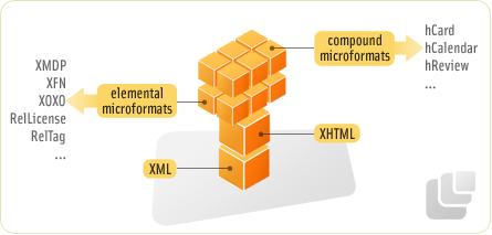
It's hardly new - not in web terms. Microformats are a method of marking-up types of content to be easily lifted or shared with other websites or applications. For instance, the name and address of your company can have certain class names attributed to your HTML elements. These class-names can then be read by a web app, which will allow a site visitor to insert those details directly into your address book with the click of a link. Microformats are not that difficult to apply - in most cases it's just a slight modification of your HTML classes.


Put in more plain English, it’s about marking up your (X)HTML with semantic and predefined class names and ids. If everyone uses the same class names for a certain type of data, we can write programs to parse it.

More info found in
Read more!

The benefits of Web Standards to your visitors, your clients and you!

Benefits of Web Standards
http://www.maxdesign.com.au/presentation/benefits/

CSS Tips
CSS Tips Read more!

21 advices ... guides

ONE. Give people more than they expect and do it cheerfully.

TWO. Marry a man/woman you love to talk to. As you get older, their conversational skills will be as important as any other.

THREE. Don't believe all you hear, spend all you have or sleep all you want.

FOUR. When you say, 'I love you,' mean it.

FIVE. When you say, 'I'm sorry,' look the person in the eye.

SIX. Be engaged at least six months before you get married.

SEVEN. Believe in love at first sight.

EIGHT. Never laugh at anyone's dreams. People who don't have dreams don't have much.

NINE. Love deeply and passionately. You might get hurt but it's the only way to live life completely.

TEN.. In disagreements, fight fairly. No name calling.

ELEVEN. Don't judge people by their relatives.

TWELVE. Talk slowly but think quickly.

THIRTEEN! . When someone asks you a question you don't want to answer, smile and ask, 'Why do you want to know?'

FOURTEEN. Remember that great love and great achievements involve great risk.

FIFTEEN. Say 'bless you' when you hear someone sneeze.

SIXTEEN. When you lose, don't lose the lesson.

SEVENTEEN. Remember the three R's: Respect for self; Respect for others; and Responsibility for all your actions.

EIGHTEEN. Don't let a little dispute injure a great friendship.

NINETEEN. When you realize you've made a mistake, take immediate steps to correct it.

TWENTY. Smile when picking up the phone. The caller will hear it in your voice.

TWENTY- ONE. Spend some time alone.
Read more!

Building Joomla! sites from scratch, and systematically customizing them to your needs


Building Joomla! sites from scratch.

A sitemap is critical to having a well organized site. You must make an effort to draft one before you start working in the administrator backend.

Joomla generates a page the instant you click its link. This means that the pages viewed can be easily changed by changing the menu links rather than the content itself.

Joomla offers two methods to organize articles. The first is to use uncategorized articles, which are suited for very small sites. For larger sites the second method of sections in categories needs to be used.


Making your pages with uncategorized content items is the simplest way to build a Joomla site, but it is difficult to manage with more than a dozen pages.


Sections and Categories

If I have many more articles than a dozen, using uncategorized articles isn't going to work. If I pick up the stack, I might have to flip through a thousand pieces of paper.

Joomla offers two levels: the highest is called sections, and below that are categories.

You can't put content items in a section; they must go in a category. This means that each section needs at least one category.
Read more!

DTD - The Document Type Declaration

A DTD is a Document Type Definition, also know as DOCTYPE. In a document served as text/html, the DOCTYPE informs the browswer how to interpret the content of the page.

If the the doctype is not declared, the browser assumes you don’t know how to code, and goes into "quirks mode". If you know what you are doing and include a correct XHTML DOCTYPE, your page will be rendered in "standards mode".


All of the above declarations will inform the browser to render the browser in standards mode. When authoring document is HTML or XHTML, it is important to Add a Doctype declaration. The declaration must be exact — both in spelling and in case. And, the URL must be included. If not, you risk having your page rendered in quirks mode. A list of the DTD’s and how browsers handle them can be found at http://hsivonen.iki.fi/doctype/

There are other DTD’s, such as for MathML and "http://www.openmobilealliance.org/tech/DTD/xhtml-mobile12.dtd"> for mobile. A list of valid DTDs is maintained at http://www.w3.org/QA/2002/04/valid-dtd-list.html

The XML declaration for XHTML web pages of is optional. Older browsers such as IE5 for the Mac choke on this. And, if you include it, IE6 renders in quirks mode, but IE7 renders in standards. So, for now, omit it. But, if you do include it, it must be the very first line, before the DTD


Why is quirks mode bad? Ever code a page and have the font inside your data tables be huge? That’s because in quirks mode browsers render td’s based on the browser default, not on the declared body default size. The box model is rendered differently and images as block instead of inline.

Why are DTD’s good? In addition to everything above, a DTD enables you to have valid code. To test validity, a page is compare to the rules for that document type. If you don’t have rules, how do you compare it? The DTD tells the validator what rules to use.

What is the difference between strict and transitional? Transitional allows depreciated tags and attributes to pass validation. The strict doctype is strict: depreciated tags and attributes will fail to validate under a strict doctype and may well display incorrectly as well. See Comparing XHTML and HTML, Strict and Transitional and Deprecated Elements and Attributes.

What does PUBLIC mean? In the above DOCTYPEs, all of them include the term "PUBLIC". If you are creating your own DTD then put your DTD on your sever and include the term "SYSTEM" with the path to your DTD file. On the other hand, if you are using PUBLIC DTD’s, such as those listed above, and the public identifier which starts with -//.

Read more!

Fix Your Site With the Right DOCTYPE!

by JEFFREY ZELDMAN
You’ve done all the right stuff, but your site doesn’t look or work as it should in the latest browsers.

You’ve written valid XHTML and CSS. You’ve used the W3C standard Document Object Model (DOM) to manipulate dynamic page elements. Yet, in browsers designed to support these very standards, your site is failing. A faulty DOCTYPE is likely to blame.

This little article will provide you with DOCTYPEs that work, and explain the practical, real–world effect of these seemingly abstract tags.

WHY A DOCTYPE?
Per HTML and XHTML standards, a DOCTYPE (short for “document type declaration”) informs the validator which version of (X)HTML you’re using, and must appear at the very top of every web page. DOCTYPEs are a key component of compliant web pages: your markup and CSS won’t validate without them.

As mentioned in previous ALA articles (and in other interesting places), DOCTYPES are also essential to the proper rendering and functioning of web documents in compliant browsers like Mozilla, IE5/Mac, and IE6/Win.

A recent DOCTYPE that includes a full URI (a complete web address) tells these browsers to render your page in standards–compliant mode, treating your (X)HTML, CSS, and DOM as you expect them to be treated.

Using an incomplete or outdated DOCTYPE—or no DOCTYPE at all—throws these same browsers into “Quirks” mode, where the browser assumes you’ve written old-fashioned, invalid markup and code per the depressing industry norms of the late 1990s.

In this setting, the browser will attempt to parse your page in backward–compatible fashion, rendering your CSS as it might have looked in IE4, and reverting to a proprietary, browser–specific DOM. (IE reverts to the IE DOM; Mozilla and Netscape 6 revert to who knows what.)

Clearly, this is not what you want. But it is often what you’ll get, due to the preponderance of incorrect or incomplete DOCTYPE information this article hopes to correct.

(Note: The Opera browser does not play by these rules; it always attempts to render pages in standards–compliant mode. Go, Opera! On the other hand, Opera does not yet offer solid support for the W3C DOM. But they’re working on it.) {Ed: Since this article was first published, Opera has delivered the DOM-compliant Opera 7 browser.}

WHERE HAVE ALL THE DOCTYPES GONE?
Since DOCTYPES are vital to the proper functioning of web standards in browsers, and since W3C is a leading creator of web standards, you might expect W3C’s website to provide a listing of proper DOCTYPEs, and you might also expect to be able to find this information quickly and easily in a single location. But as of this writing, you can’t. {Ed. Prompted in part by this article, the W3C now lists standard DOCTYPEs on its site. You will find the listing a few screens into the W3C tutorial, “My Web site is standard. And yours?”}

W3.org is not A List Apart, WebReference, or Webmonkey. It’s not intended to help web designers, developers, and content folks get up to speed on the latest technological recommendations and practices. That’s not its job.

W3C does publish a series of tutorials, though most web developers are unaware of it. Mainly, though, W3C’s site houses a collection of proposals, drafts, and Recommendations, written by geeks for geeks. And when I say geeks, I don’t mean ordinary web professionals like you and me. I mean geeks who make the rest of us look like Grandma on the first day She’s Got Mail.™

You can search for DOCTYPEs all day at w3.org without finding one page that lists them all. And when you do hunt down a DOCTYPE (generally in relation to a particular Recommendation or Working Draft), it’s often one that won’t work on your site.

Scattered throughout W3C’s site are DOCTYPEs with missing URIs, and DOCTYPEs with relative URIs that point to documents on W3C’s own site. Once removed from W3C’s site and used on your web pages, these URIs point to non–existent documents, thus fouling up your best efforts and the browser’s.

For instance, many sites sport this DOCTYPE, copied and pasted directly from w3.org:

"DTD/xhtml1-strict.dtd">
If you look at the last part of the DOCTYPE (“DTD/xhtml1-strict.dtd”), you’ll see that it is a relative link to a document on W3C’s site. Since that document is on W3C’s site but not yours, the URI is useless to the browser.

The DOCTYPE you’d actually want to use is:


"http://www.w3.org/TR/xhtml1/DTD/xhtml1-strict.dtd">
Notice that the latter DOCTYPE includes a complete URI at the end of the tag. Since the tag provides a valid location on the web, the browser knows where to find it, and will render your document in standards–compliant mode.

DOCTYPES THAT WORK
So what DOCTYPEs should we use? Glad you asked. The following complete DOCTYPEs are the ones we need:

HTML 4.01 STRICT, TRANSITIONAL, FRAMESET
"http://www.w3.org/TR/html4/strict.dtd">


"http://www.w3.org/TR/html4/loose.dtd">


"http://www.w3.org/TR/html4/frameset.dtd">
XHTML 1.0 STRICT, TRANSITIONAL, FRAMESET
"http://www.w3.org/TR/xhtml1/DTD/xhtml1-strict.dtd">


"http://www.w3.org/TR/xhtml1/DTD/xhtml1-transitional.dtd">


"http://www.w3.org/TR/xhtml1/DTD/xhtml1-frameset.dtd">
XHTML 1.1 DTD
"http://www.w3.org/TR/xhtml11/DTD/xhtml11.dtd">
NEXT STEPS
How can you help improve support for standards on the web? Besides bookmarking this page (and copying and pasting these DOCTYPEs for your own use), if your web editor inserts DOCTYPEs, you might want to check them out and compare them to the list above.

Many well–intentioned software makers have cut and pasted incomplete DOCTYPEs from W3C into their software. Result: when you use these programs’ built–in functionality to insert DOCTYPEs in your pages, the browsers go into Quirks mode, undoing all your hard work.

It’s worth contacting the folks who make your favorite authoring package, showing them the proper DOCTYPEs, and politely requesting them to address this issue in an incremental upgrade. (In some cases, you may also be able to modify your editor yourself.)
Read more!

Building a site with web standards

Why and How to use Web Standards?

1. What are web standards?
“Web standards are intended to be a common base… a foundation for the world wide web so that browsers and other software understand the same basic vocabulary“.
Eric Meyer


Who sets the webstandards?
The World Wide Web Consortium (W3C) and other standards bodies have established technologies for creating and interpreting web-based content. These ‘web standards’ are carefully designed to:

deliver the greatest benefits to the greatest number of web users
ensure the long-term viability of any web document
simplify code and lower the cost of production
deliver sites that are accessible to more people and more types of Internet devices
continue to function correctly as traditional desktop browsers evolve, and as new Internet devices come to market

2. The web standards
Structural Languages
Extensible Hypertext Markup Language (XHTML) 1.0
XHTML 1.1
Extensible Markup Language (XML) 1.0
Presentation Languages
Cascading Style Sheets (CSS) Level 1
CSS Level 2
CSS Level 3
Object Models
Document Object Model (DOM) Level 1 (Core)
DOM Level 2
Scripting Languages
ECMAScript 262 (the standard version of JavaScript)
Additional Presentation Languages (Markup)
Mathematical Markup Language (MathML) 1.01
MathML 2.0
Scalable Vector Graphics (SVG) 1.0

3. What are the benefits of using web standards?
Benefits for you:
Less code means sites are easier to maintain
Less browser specific coding - compatible with current browsers
Less revisiting of old sites - compatible with future browsers

Benefits for your audience:
Less code means sites are faster downloads
More accessible - will work in a wider variety of user agents

4. What do standards mean to web developers?
Web designers and developers should be aim to build sites that use:

Semantic markup
Valid code
Accessible code
Separation of style from content

5. Semantic code
Semantic code uses html elements for their given purpose. Well structured HTML will have semantic meaning for a wide range of users and user agents (browsers without style sheets, text browsers, PDAs, search engines etc.)

In simple terms, this means:

for headings, use heading elements starting with h2
for paragraphs of text, use a paragraph element
for lists, use a list item element
You should use standard HTML elements for your markup and avoid styling HTML elements to look like other HTML elements. For example, avoid styling
elements to look like headings.

6. Why use valid code?
Valid code will render faster than code with errors.
Valid code will render better than invalid code.
Browsers are becoming more standards compliant, and it is becoming increasingly necessary to write valid and standards compliant HTML

7. How do you make your code valid?
Start with the right doctype
Be aware of doctype modes (standards compliant, quirks mode etc)
Use a character set
Close HTML elements
Use alt tags for images
Avoid HTML hacks
Use HTML validators regularly
Fix any bugs you find before you go live
Make validation part of your normal work process

8. What is accessible code?
Allows your site to be accessible to a larger audience (vision impaired, motor skill impaired, cognitive impaired)
Allows your site to be accessed by wider range of devices (hand helds, screen readers, text browsers, search engines)
Is a requirement for Federal and State Government sites

9. How do you make your code accessible?
Provide text equivalent for non-text elements
Use accessible data tables (identify row and column headers)
Use accessible forms (label for, id, fieldset, legend)
Use markup rather than images to convey information.
Provide visible skip menus
Provide access keys
Use style sheets with relative units to control layout and presentation
Make sure documents can be read without style sheets
Provide metadata to add semantic information
10. Separating style from content
Easier to make site-wide changes - one css file rather than all pages
Smaller files/faster download - less code on the page
Less code on the page - easier to code
Allows users to customise to their own needs - style switchers
More control over code - can deliver code in preferred order for screen readers
Files are more accessible to a wider variety of mediums - separate css files for other devices

11. How do you separate style from content?
Decide on a browser support level and code methodology
If full CSS is the chosen methodology, decide on a CSS positioning method
Place content into containing boxes
Use CSS positioning to control layout of containing boxes
Use CSS to control the visual appearance of all html elements
Test on a wide variety of browsers at each stage
Read more!

What is JQuery


jQuery is an amazing JavaScript library that makes it easy to create wonderful web effects in just a few lines of code. As the website says:”

jQuery is a JavaScript library that takes this motto to heart: Writing JavaScript code should be fun. jQuery achieves this goal by taking common, repetitive, tasks, stripping out all the unnecessary markup, and leaving them short, smart and understandable.”

Maybe you are thinking… “Why I would need another JavaScript library”? Just give a try and you will see how simple and powerful it is even if you have already used Moo.fx, Scriptaculous, TW-SACK or Prototype.

Why I should use jQuery?
Simple. In just one glance at the source code of a page using jQuery you’ll see how easy it is to use, how much it accomplishes in so few lines of code, and how graceful it is.
My mind was opened one day when I stumbled across some code written with jQuery. I was flipping through the RSS feeds and reading my daily dose of web design blogs when I came across an example of JavaScript loveliness that used jQuery. Truth be told, the code on that site had some browser related bugs… but the concept was something I hadn’t seen before.

What about the code?
The code looked almost simple. Like nothing I had seen before. It made sense.
I started reading through the documentation and was amazed to see how much could be done with so little extra code.

When you can use jQuery?
You should use jQuery when you need:
A small library that gives you powerful control over the Document Object Model
With very little effort or work on your part
Or
Quick access to AJAX
Without a lot of bloat (overhead - wasted code)
And some basic animation effects to spice things up
But…
If you need super fancy effects for animation, drag and drop, and super smooth animation then you’ll probably want to use Prototype and one of the many great library created to enhance the effects.

Where to get it?
You can download the source code (15k), a lot of plugins and read some excellent tutorials at the
jQuery website. jQuery was created by John Resig.
Read more!

jQuery

jQuery is a fast, concise, JavaScript Library that simplifies how you traverse HTML documents, handle events, perform animations, and add Ajax interactions to your web pages. jQuery is designed to change the way that you write JavaScript.


jQuery is an amazing JavaScript library that makes it easy to create wonderful web effects in just a few lines of code. As the website says:”


“jQuery is a JavaScript library that takes this motto to heart: Writing JavaScript code should be fun. jQuery achieves this goal by taking common, repetitive, tasks, stripping out all the unnecessary markup, and leaving them short, smart and understandable.”
Maybe you are thinking… “Why I would need another JavaScript library”? Just give a try and you will see how simple and powerful it is even if you have already used Moo.fx, Scriptaculous, TW-SACK or Prototype.


Why I should use jQuery?
Simple. In just one glance at the source code of a page using jQuery you’ll see how easy it is to use, how much it accomplishes in so few lines of code, and how graceful it is.
My mind was opened one day when I stumbled across some code written with jQuery. I was flipping through the RSS feeds and reading my daily dose of web design blogs when I came across an example of JavaScript loveliness that used jQuery. Truth be told, the code on that site had some browser related bugs… but the concept was something I hadn’t seen before.


What about the code?
The code looked almost simple. Like nothing I had seen before. It made sense.
I started reading through the documentation and was amazed to see how much could be done with so little extra code.


When you can use jQuery?
You should use jQuery when you need:
A small library that gives you powerful control over the Document Object Model
With very little effort or work on your part
Or
Quick access to AJAX
Without a lot of bloat (overhead - wasted code)
And some basic animation effects to spice things up
But…
If you need super fancy effects for animation, drag and drop, and super smooth animation then you’ll probably want to use Prototype and one of the many great library created to enhance the effects.


Where to get it?
You can download the source code (15k), a lot of plugins and read some excellent tutorials at the
jQuery website. jQuery was created by John Resig.


Read more!

Check your markup and style validity

http://xhtml-css.com :
This is a website that helps you check the markup and style validity of web pages. It does this by submiting the urls that you want to check to the W3C Markup and the W3C CSS Validators. Read more!

What does a front-end web developer do?

Front-end web developers, the "artists" formerly known as web designers are the bunch of people in the company that make sure that the data coming from the backend gets displayed on the browser. They also make sure it looks as closely as possible as the design, that , CED came up with, and that the user can navigate through it, accessing the data.


Front-end web developers, the "artists" formerly known as web designers are the bunch of people in the company that make sure that the data coming from the backend gets displayed on the browser. They also make sure it looks as closely as possible as the design, that , CED came up with, and that the user can navigate through it, accessing the data.


Web developers don't have it as easy as it sounds though. True enough, markup languages are easy to learn and scripting languages are not much harder, but there is an aspect of uncertainty, that has to be taken into consideration, when judging their skills.

As a web developer you work in an uncertain environment. What looks good and works on your computer can be a popup hell and dire to look at on the machine next to you or on the machine of a customer. The first is not much of a problem, just ask your colleague to upgrade his browser, the second, however, is a problem.

As a web developer, your work can be wrecked by users and customers in many ways:

They can

* use a browser that is completely outdated
* set his browser font to "very small" or "very large"
* use a video card that displays 16 colours only
* run a resolution of 640x480 pixels and still have the large font setting
* run a resolution of 1024x768 but still keep his window as large as 200x200
* use loads of toolbars to make the area of the screen available for your site pitifully small
* turn off any scripting support for safety reasons
* turn off images to load the pages faster
* use a modem with the speed of two tins connected through a wire
* use a PDA
* use a text-only browser

and if the site does not work with that, they'll blame you for it.

In other words, you never know what is going to be the mean of display at the other end.

What to do about that? Don't fret, there are standards that the World Wide Web Consortium (W3C) defined a long time ago. Just follow these standards and you are safe.

The only problem is that the browser industry keeps telling their products follow these standards, but, in reality, they don't.

So by doing the right thing, you do the wrong thing. By following the standards, you make sure that your site will perform fine in future browsers and display units. On nowadays and yesterdays browsers though, there might be loads of issues.

What you do need to do is to make sure your site is following the standards and still looks OK on older browsers. This is the perfect option. Another would be to define a certain browser and platform environment. This is possible when we are talking about Intranets and B2B sites, but B2C means you are in trouble.

You are really in trouble, when the design you got was done by a designer who is not firm in web design. The web is a media, not a sheet of paper. Designs that look really nice on paper (and impress customers) might not work on the web. Same as screen layouts do not work on television or game consoles.

Users are able to resize the text part of your page, or, in newer browsers even add own rules of display onto your site (through own stylesheets). This means that every layout, that relies on fixed font-sizes, and text, that can only use up a certain area, is doomed to fail.

You can go the other extreme and keep everything flexible, which may result in really ugly texts, with lines too long to be readable. This is a minor issue though, as, when the user has a problem with that, he can simply resize his browser window.

In any case a good web developer needs to know a lot about the media he works in.

He needs to know

* what browser/platform configuration breaks your page when you use which technology
* which technology or elements to use to create the navigation in
* what to do to avoid wrong display on browsers
* how to keep the size of the final document small
* how to convert graphics so that they are small in file size and yet good looking
* how to deal with data coming from the customer in various and sometimes rather exotic formats
* how to keep his work from stalling when there is no data coming in that he can use.
* How to communicate to colleagues or customers that the amount of final data in the product does not really fit the design (which is a case of bad planning to begin with, but it does happen)
* How to keep up with the rapid web development market and techniques.

These are the most obvious bits. Another obstacle a web developer has to tackle all the time is the media and software market hype.

At every computer fair and in magazines software companies advertise products, that help you do a web site in 20 minutes without knowing anything about code. For good measure you can also add all the multimedia you want and connect it to the database, you don't know anything about either.

When looking at these ads one starts to wonder why people care about hacking in their HTML. Front-end development is considered a task that can be fulfilled by any application or even the export filter of a graphics development program.

True, these applications do put out HTML and Javascript. True, the results look good. Wrong, they can replace a web developer. They can replace a "web designer", someone who hand-codes "HTML designs". When talking about HTML designs, I mean web sites without any other purpose but being eye candy. Standalone, plain HTML documents, a few links, some rollovers, but no back end connections or interactvity. Sites that are nothing but an ad can be safely done with them. As soon as you need the site to fulfil a specific task, be really optimised and fit the other components in your development framework, these WYSIWYG editors (like Dreamweaver, Frontpage, Adobe Pagemill and so forth) stop being that handy.

The worst nightmare for a front-end developer is to be confronted with markup code generated by these programs. A script or application can never optimise like a human being can, the code is bloated, unreadable and not logically structured in most of the cases. Keeping in mind that the outcome was meant to look great for 20 minutes work, why would it? The user never sees the source code. The developer does, and it's his job to keep it as small, fast and readable as possible. Especially when you remember, that he might have to hand it over to another developer for changes.

The availability of web content is amazing and great, but also has a downside to it. Content and code can be published immediately and is available to everybody. This is very nice and actually one of the main reasons to make people start web developing. After all it's easier to create your first web site than to try and get some time on TV or radio. The downside of it is that content gets published without any quality testing. Any enthusiastic developer, with more drive than skill. creates some new, cool design or effect, and publishes it on his web site. As it is cool and new, other developers see it, and implement it as well, to stand out from the crowd. Looking at this effect closely makes it obvious that it only makes sense in a very restricted browser environment and only for some content. Sometimes it might not even make sense at all. Nevertheless it becomes more and more spread and used, and sooner or later customers will see it and want it as well. Or colleagues see it, don't realise the flaws it might have (as it works on their browser) and offer it to the customer.

Then the web developer gets asked to implement it, and gets blamed when it does fail in the quality test.

There is no such thing as free lunch. Also there is no such thing as a perfect web site that you assemble from free content from the web without knowing what you do. Script libraries and personal developer sites advertise their content much like software companies. They claim their products have perfect output. Truth is, you can find anything on the web, and that is great, but make sure you test it thoroughly before you even think about using it in a product someone pays you for.

To conclude, the web developer is the developer on the project that has it all: A very unstable display environment, a skill set that needs to range from code to design and usability, and the blame when the end product does not look the way it should.

It's a hybrid position, you are someone that paints with code. Programmers don't accept your work as real code, and designers don't consider it design.

Now you might be at the point where you ask yourself: If that is such a horrid position in the development circle why bother taking it?

Well, the love for the media I suppose. The challenge to make things visible to users and not exclude a lot of them. The hybrid position in between programmers and designers and dealing with both. The satisfaction of seeing things you have done online and realising that people use it. The immediate satisfaction of hacking in some funny words with brackets around them and controlling the layout of a text by doing so.

It is a position that needs constant improvement, and interest in the media you work for. The days of front-end developers that attend a 2 day course and make a lot of money the week after are over. Now it is the job to clean up the mess those "web designers" left behind. To work with design and backend and project managers to make sure the customer gets something that is looking good and works fast and reliable.

So next time you think about smiling about those tag coders or HTML monkeys (I saw that as an official title in a work contract) you are welcome to try it yourself.

Read more!

Front End Developer ( who is ..)


You have been working with (X)HTML and CSS for anywhere from 1-4 years. You prefer front end development because you're creative and visual and have a good eye for design. You write standards-compliant / semantic (X)HTML and CSS without Googling the syntax or using WYSIWYG editors.

You understand the difference between standards mode and quirks mode. You know what the box model hack is and what versions of IE it works for. You may love Firebug because it saves your life or you are so good you don't need it. You can use Gimp, Fireworks or Photoshop to cut up images and are handy with designing an icon or two in a pinch.

You are not uncomfortable working in the context of a complex Java web application even if you don't understand its intricacies. You won't get scared off by scripting markup like Velocity or JQuery showing up in the code here and there.

You are a self starter who loves working with technology and you stay up late putting the finishing touches on your code. You don't need to be told what to do to see what needs to get done. You are excited about working with a leading open source software company with cutting-edge opportunities at Fortune 500 companies around the world.

Read more!

What happens in Quirks Mode?

Quirks Mode is a mode of operation of web browsers such as Internet Explorer (IE), Firefox, and Opera. Basically, Quirks Mode (also called Compatibility Mode) means that a relatively modern browser in ten tio nal ly simulates many bugs in older browsers, especially IE 4 and IE 5.


Quirks Mode is a mode of operation of web browsers such as Internet Explorer (IE), Firefox, and Opera. Basically, Quirks Mode (also called Compatibility Mode) means that a relatively modern browser in ten tio nal ly simulates many bugs in older browsers, especially IE 4 and IE 5.

Quirks Mode is triggered by doctype sniffing, also known as doctype switching. This means that the browser inspects the start of an HTML document to see whether it contains a doctype declaration as required by HTML specifications.
The purpose of Quirks Mode is to make old pages to display as their author intended. Old pages may have been written to utilize known features of old browsers or at least to adapt to them. For more information about Quirks Mode in general, consult the QuirksMode.org site.

There is no authoritative specification of what happens in Quirks Mode. After all, the mode is, by essence, an inten tional violation of CSS and HTML specifications. However, since authors may need a description of what may actually happen in Quirks Mode, I have composed this document.

If you have an existing page that seems to work well but lacks a doctype dec la ra tion (required by HTML specifications) at the beginning, you should not simply put such a dec la ra tion there. The reason is that the dec la ra tion makes browsers work in the so-called Standards Mode as opposite to Quirks Mode. This may mean just about anything. I have seen the entire content of a page disappear when you add a doctype dec la ra tion. More often, the layout changes in rather un ex pect ed ways. Well, the ways are not that un ex pect ed if you know what may happen in Quirks Mode. Before adding a doctype dec la­ra tion, you should check both the HTML and CSS code for syntactic correctness by using validators and checkers. This may not be enough, since the page might still have been written relying on things that just “work”—in Quirks Mode. Thus, you should test the page at least on IE 7 and Firefox 2 in Standards Mode, i.e. after adding a doctype dec la ra tion. If the page doesn’t work then, the following list might be useful for spotting the problem.
When creating a a new page, you need not know about Quirks Mode and should usually not think about it. Simply write according to HTML and CSS specifications; this includes using a doctype dec la ra tion that puts modern browsers into Standards Mode. Moreover, put the doctype declaration at the very start, since some browsers go to Quirks Mode, if there is anything (even a comment) before it. (This causes trouble if you are using XHTML, but in most cases, you shouldn’t use XHTML for web pages anyway, for the time being.) But if you decide to use some features that might only work in Quirks Mode, such as a height="100%" attribute for a table element, you should check the list for other possible implications.
Read more!

Printing the Web: Solutions and Techniques

Users don’t read, they scan. In fact, after many years, reading online still didn’t manage to assert itself against reading offline. Therefore long articles are usually printed out and read on paper. However, not every page will be printed out correctly by default - sometimes layout doesn’t fit, sometimes font size isn’t chosen properly or leading simply isn’t big enough. It is also important to include some further references to the printed version of the page, so users can get back to you, once they’ve read the printed version of your article.
Good news: web-developers can control the way web-site looks on the paper.To make sure that no data will lost and the legibility of content remains optimal after the printing, you can, of course, use CSS.
There are many options and techniques you can use developing print layouts. Here is a quick overview of some interesting solutions you can use to generate print layouts “on the fly”.
Printing the Web: CSS-Techniques
Five Simple Steps to Typesetting on the web: Printing the webMike Boulton gives an example on how to design a nice print layout, which looks like print layout in traditional magazines.
Footnote Links: Improving Link Display for PrintAaron Gustafson presents a CSS+JavaScript-based method, which replaces all links on a page with corresponding footnotes. Elegant and extremely (!) useful solution.
10 Minutes to Printer-Friendly PagePrint-layouts can be generated with PHP. Marko Dugonjic shows, how.
From Screen to Print: Creating a Print CSS in DreamweaverThis article will examine how our layout displays one set of elements on the screen, yet when printed, prints a different layout using elements that do not display on screen.You’ll learn about media types and how to take advantage of them and using the cascade to create lightweight, compact pages for print. Since Community MX constantly tweaks its site, some things may be slightly different if you read this article a few months from its publishing date.
A Print CSS PrimerA detailted introduction and tutorial by Kenji Ross.
Print DifferentQuite an old article by Eric Mayer, in which he describes different media types you should consider designing print layouts.
ALA’s New Print StylesEric Meyer about A List Apart Print-Layout. The article is a “follow-up” of the article CSS Design: Going to Print, which was published in ALA 2002.”Say no to “printer-friendly” versions and yes to printer-specific style sheets. CSS expert Eric Meyer shows how to conceive and design print style sheets that automatically format web content for off-screen delivery. Includes tips on hiding inappropriate content, styling text for the printer, and displaying the URL of every link on the page.”
CSS Styling for Print and Other MediaIan Lloyd about the media-attribute and development of user-friendly print layouts.”There are many different media types that you can apply to CSS, some of which are more useful than others, and they let you specify the look, feel, or sound of the web page that is linked to the CSS files. In this section, we’ll look at the various media types that are available.”
Complete CSS Guide: PrintingIn CSS2, the page properties are defined by the @page rule, while several new properties help control page breaking. John Allsopp explains in detail, which guidelines you should keep in mind designing print layouts and how you use @page-rules such as page-break-before, Widows, Orphans etc. efficiently.
Printing The WebJames Kalbach describes common mistakes and discusses important aspects of print layouts regarding usability.”Consider how users interact with other formats and media, particularly paper, and address the reality that people print web pages. With a little planning and foresight creating printable pages is relatively easy and extends a positive user experience to paper.”
Dive Into Mark Print-friendly Linksworks just the way Footnote Links work, but also adds the URLs of Links in the brackets after the links.
Print-Friendly CSS and UsabilityRoger Johansson discusses, whether print layouts, which are different from the page structure, are user-friendly. Themaninblue’s post on the same topic.
Print to PreviewPete McVicar’s JavaScript creates a preview page with a warning message users can use to navigate back to the original page.
Printing Web documents and CSSJim Wilkinson explains, what print layouts should have, (e.g. the URL of the original web-page), which elements should be removed (e.g. navigation) and what how you should handle links, footers and headers. Also problems in different browsers are taken into consideration.”This document describes some of the issues concerning the use of CSS to reformat Web documents for printing (using the media type “print”). We also discuss those aspects that CSS is not able to control or even influence. We assume a good knowledge of CSS and concentrate on practical issues, given the current deficiencies in browsers in implementing print-related CSS.”
Read more!

Web Design Basics

Guide to Web Design / HTML
Web design uses all the same elements as print design. You need to explore the space and layout, handle fonts and colors, and put it all together in a format that puts your message across. These resources will help you learn Web design whether you are already a professional Web developer or just getting started in the Web arena.
Elements of Good Design
Fonts and Typography
How to Use Color
Graphics and Images
Web Layout Basics
Tackling Web Navigation
Accessibility and Usability
Web Design Software
Elements of Good Design Read more!

Process of Web design

Web design is a process of conceptualization, planning, modeling, and execution of electronic media content delivery via Internet in the form of technologies (such as markup languages) suitable for interpretation and display by a web browser or other web-based graphical user interfaces (GUIs).

The intent of web design is to create a web site (a collection of electronic files residing on one or more web servers) that presents content (including interactive features or interfaces) to the end user in the form of web pages once requested. Such elements as text, forms, and bit-mapped images (GIFs, JPEGs, PNGs) can be placed on the page using HTML, XHTML, or XML tags. Displaying more complex media (vector graphics, animations, videos, sounds) requires plug-ins such as Flash, QuickTime, Java run-time environment, etc. Plug-ins are also embedded into web pages by using HTML or XHTML tags. Read more!